Accessible Signage in Norway: TEK17 Requirements Explained
What do the Norwegian building regulations (TEK17) require of signs in public buildings, workplaces and housing? Here are the requirements section by section, with contrast values, heights and a sign plan checklist, taken directly from Lovdata and the DiBK guidance.
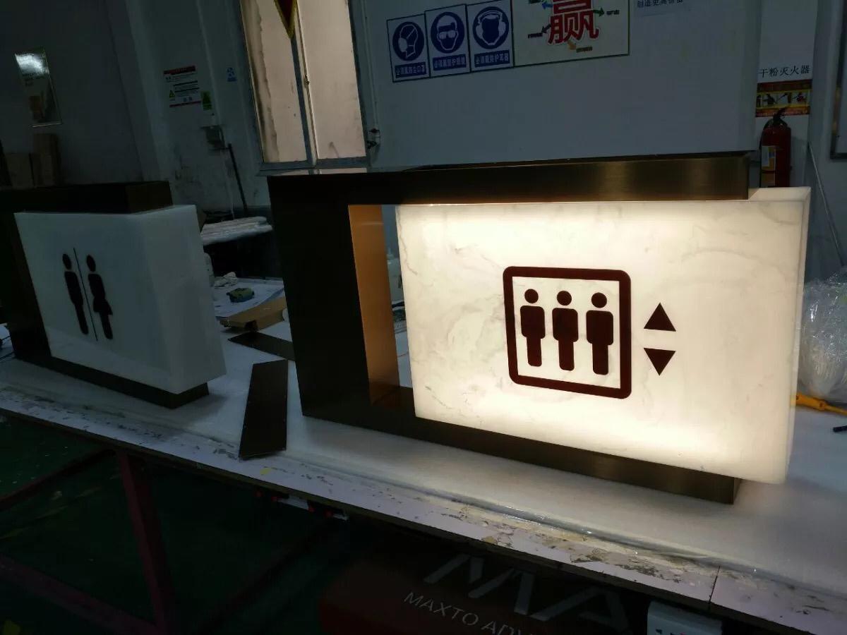
What does TEK17 require of signs?
TEK17, the Norwegian building technical regulations, requires signs to be easy to understand and to have a luminance contrast of at least 0.8 between text and background (section 12-18). In public and workplace buildings, signs must also be placed so they are visible to both seated and standing people, and floor numbers must be legible both visually and by touch on every floor (section 12-6).
Those two sections matter most for signage. The other requirements are spread across the regulation: glass marking, column marking, floor indication in stairs and escape route marking. Below we have collected them in one table, with the section next to each requirement. The article is based on TEK17 on Lovdata and the DiBK guidance (in Norwegian), read on 19 November 2026. Quoted requirements are our English rendering of the Norwegian text.
What is accessible signage?
Accessible signage (universell utforming av skilt) means signs that can be read and used by as many people as possible, including people with reduced vision, hearing, mobility or cognition, without special solutions. In practice it is about contrast, clear text, tactile information, placement and a sign system that is consistent throughout the building.
When do the requirements apply?
The universal design requirements depend on the type of building:
- Buildings for the public and workplace buildings must be universally designed under section 12-1, unless the building or part of it is unsuitable for people with disabilities because of its function. DiBK defines a building for the public as one where the public has access, and a workplace building as a building with workplaces. Shops, offices, schools, healthcare buildings, hotels and shopping centres are typical examples.
- All buildings, including housing, are covered by section 12-18 (1) and (2): signs must be easy to understand, and text must have a luminance contrast of at least 0.8. Circulation routes must be easy to find and orient yourself in (section 12-6 (2)).
- Buildings that must have accessible dwelling units also get the operating height requirement for control panels (section 12-18 (3)).
- Existing buildings: TEK17 applies to works that require a permit. Under section 31-2 of the Planning and Building Act, works on existing buildings must be designed and carried out in line with the requirements.
- Businesses aimed at the general public have a separate duty of universal design for their general functions under section 17 of the Equality and Anti-Discrimination Act. The duty is considered met when the business follows the requirements in law or regulation.
TEK17 sign requirements, section by section
| Requirement | What it means in practice | Source |
|---|---|---|
| Signs must be easy to understand | Unambiguous text, logical structure, standardised symbols | 12-18 (1) |
| Luminance contrast of at least 0.8 between text and background | Dark text on a light base or the reverse, applies to all buildings | 12-18 (2) |
| Important information as text and sound | Tactile signs may replace sound | 12-18 (2) |
| Signs and markings that give the necessary information | Easy to read, luminance contrast of at least 0.8 between text and base colour | 12-6 (6) c |
| Accessible and clearly visible to seated and standing people | Signs must work from a wheelchair and at standing height | 12-6 (6) c |
| Floor numbers visually and tactilely legible on every floor | Guidance: tactile floor numbers 0.8 to 1.2 m above the floor, at least 0.5 m from an inside corner | 12-6 (6) c with guidance |
| Auditory information supplemented with visual information | Loudspeaker announcements need a screen or sign | 12-6 (6) d |
| Direction information where the walking direction changes | Repeated information should be as consistent as possible throughout the building | 12-6 (6) g |
| Columns must not obstruct | Luminance contrast of at least 0.4 to the surroundings, or marking at two heights with at least 0.8 against the background | 12-6 (6) f |
| Dazzling backlight must be avoided in circulation routes | Affects placement of illuminated signs and glossy surfaces | 12-6 (6) e |
| Glass markers on glazing in entrances and circulation routes | Visible from both sides, at two heights centred 0.9 m and 1.5 m above the floor; different pattern on the door and adjacent glazing | 12-17 (2) |
| Floor indication in stairs | Marked at the start of each floor (in the clause on handrails, which must also have luminance contrast of at least 0.8) | 12-14 (3) b |
| Control panels at 0.8 to 1.2 m above finished floor | Covers for example card readers and door entry panels | 12-18 (3) a |
| Escape route marking and guidance systems | Long escape routes with changes of direction, or used by many people, must have good lighting and marking; large buildings and buildings for many people must have a guidance system | 11-12 (3) |
| Fire safety installations clearly marked | Applies to installations that matter for escape and rescue | 11-12 (5) |
Sources (DiBK, in Norwegian): section 11-12, section 12-6, section 12-14, section 12-17 and section 12-18.
What does a luminance contrast of 0.8 mean?
Luminance contrast is the difference in lightness between an object and its background. Hue is not what counts. Red text on a green base can look clear to many people and still have too little luminance contrast. For how the value is calculated and measured, DiBK refers to NS 11001-1:2018 and SINTEF's design guide 220.114 on luminance contrast. A requirement of 0.8 is demanding, and in practice it means very dark text on a very light background, or the reverse.
What does the DiBK guidance add?
The guidance to section 12-18 gives some clear advice that is useful in sign design:
- Easy-to-read signs have text with sufficiently large letters in a contrasting colour to the background. The guidance gives no fixed letter height.
- Text on a pattern or photograph is hard to read.
- Scrolling text is not suitable for important information.
- Standardised pictograms can replace text on some signs.
- Tactile signs can be braille.
- Font size on screens and displays must suit the expected reading distance.
The guidance to section 12-6 (2) says that signs and markings showing directions or rooms must be clearly visible, logical and legible, and that lifts and stairs in the main access route must be visible from the main entrance, clearly signed from it or located right next to it. For placement and detailing, DiBK refers to NS 3041:2007 (signage, guidance on placement and details), NS 11001-1:2018 on universal design of workplace and public buildings, and the guide on architectural means for orientation and wayfinding from DiBK and the Norwegian Public Roads Administration.
Sign plan checklist
A sign plan turns the requirements into actual signs. Use this list before production:
- Building type and requirement basis. Is the building for the public, a workplace or housing? Are any parts exempt because they are unsuitable for people with disabilities?
- Responsibility. Who is the responsible designer for universal design, and who approves the sign plan?
- Sign schedule. A numbered list with type, text, dimensions, material and location for each sign.
- Contrast. Is the luminance contrast between text and base colour documented at 0.8 or more, also under the actual lighting?
- Heights. Tactile floor numbers 0.8 to 1.2 m above the floor, at least 0.5 m from an inside corner. Other signs visible to seated and standing people.
- Tactile information. Tactile floor numbers on every floor, and floor indication at the start of each floor in stairs.
- Direction. Directional signs at every change of walking direction, and the same design, typography and symbols throughout.
- Glass and columns. Glass markers at two heights (centred 0.9 and 1.5 m) and contrast marking of columns.
- Sound and image. Important information on screens or loudspeakers is also available in the other form.
- Escape. Is the signage coordinated with the fire strategy, the guidance system and marking of fire safety installations?
Common mistakes with signs and universal design
- Contrast chosen on screen, not measured. The colours look strong in a PDF, but the luminance contrast is too low on the finished material.
- Text on patterns, photos or clear glass. The guidance says plainly that patterns and photos make text hard to read.
- Glossy surfaces and backlight. Mirror-finish metal or glossy acrylic can cause glare. TEK17 requires dazzling backlight to be avoided in circulation routes.
- Signs only at standing height. The requirement is that signs are clearly visible to both seated and standing people.
- Floor numbers without a tactile version. A painted number on the wall by the lift does not meet the tactile legibility requirement.
- A new design on every floor. Repeated information should be as consistent as possible throughout the building.
- The same pattern on a glass door and glass wall. The glass marker on the door must have a different pattern from the adjacent glazing.
- Fixed heights quoted from memory. TEK17 and its guidance give exact heights only for some elements, such as tactile floor numbers, control panels and glass markers. Other heights must be documented against the standard the project follows.
How Show Off helps with accessible signage
Show Off AS has made signs since 2017 from our workshop at Luramyrveien 17 in Sandnes, Norway. Through our wayfinding and universal design service we handle the whole process:
- Sign plan. We survey the building and produce a sign schedule with locations, dimensions, materials and design principles for typography, contrast and symbols.
- Clarification. The requirement basis and responsibilities are agreed with the developer, architect or responsible consultant before production.
- Production. Room signs, tactile signs, floor signs, directional signs and glass marking are produced in our own workshop, with short lead times.
- Installation. Our own team installs according to the sign plan, so heights and positions end up as drawn.
If you also need facade signs, illuminated signs or reception signs, see all our signage solutions. You may also like our guides to interior signs and wayfinding and office signs from reception to meeting rooms. We respond to enquiries within 24 hours. Get in touch for a review of the signage in your building.
Sources
- TEK17 on Lovdata (regulation text, Norwegian)
- DiBK: TEK17 chapter 12 with guidance
- DiBK: section 12-18 Signs, control panels and fittings
- DiBK: section 12-6 Circulation routes
- DiBK: section 12-17 Windows and other glazing
- DiBK: section 11-12 Measures affecting escape and rescue times
- Equality and Anti-Discrimination Act, section 17
- Planning and Building Act, section 31-2
Frequently asked questions
What does TEK17 require of signs?
Signs must be easy to understand, and text must have a luminance contrast of at least 0.8 against the background (section 12-18). In buildings that must be universally designed, signs must also be accessible and clearly visible to both seated and standing people, and floor numbers must be visually and tactilely legible on every floor (section 12-6).
Which buildings must have accessible signage?
Buildings for the public and workplace buildings must be universally designed under section 12-1, unless the building or part of it is unsuitable for people with disabilities because of its function. The legibility and contrast requirements in section 12-18 (1) and (2) apply to signs in all buildings.
At what height should tactile signs be mounted?
The DiBK guidance gives an exact height for tactile floor numbers: between 0.8 and 1.2 metres above the floor and at least 0.5 metres from an inside corner. For other signs, the regulation says they must be visible to seated and standing people, without a fixed height. Detailed placement is settled against NS 3041 and NS 11001-1 in the sign plan.
Is braille required on all signs?
No. TEK17 uses the word tactile, not braille. The regulation requires tactilely legible floor numbers and that important information is available as text and sound, where tactile signs may replace sound. The guidance says tactile signs can be braille. Whether braille is used is decided in the project's requirement basis.
What does a luminance contrast of 0.8 mean?
Luminance contrast is the difference in lightness between text and background. TEK17 requires at least 0.8 between text and background on signs. In practice that means very dark text on a light background, or the reverse. Hue alone, such as red against green, does not necessarily give enough contrast.
Does TEK17 apply when we replace signs in an existing building?
TEK17 applies to works under the Planning and Building Act, and section 31-2 of that Act says that works on existing buildings requiring a permit must meet the requirements. Businesses aimed at the general public also have their own duty of universal design under section 17 of the Equality and Anti-Discrimination Act.
Can Show Off make a sign plan and produce accessible signs?
Yes. We make sign plans with a sign schedule, placement and design principles, produce the signs in our own workshop in Sandnes and install them. The requirement basis and responsibilities are agreed with the developer or architect before production.

Jan Tore Råen
Partner and signage advisor
Jan Tore works with signage, facade signs, wayfinding, and visual branding for businesses across Norway. He advises on materials, visibility, permit requirements, and installation.
Relevant projects
See real client cases and deliveries closely related to the topic of this guide.
Stay updated
Subscribe to our newsletter for tips on branding, wrapping and more.